Welcome to the Beautiful New LDS.net
The new LDS.net is here!
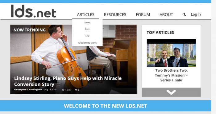
We proudly announce our newly launched design. We hope you agree that the new LDS.net is elegant and easy to use.
Why a New LDS.net?
We loved the bright and fun LDS.net design that helped launch the blog portion of our site two years ago. Since that launch, however, more than four million people have visited the site more than twelve million times!
As our readership grew and changed, we wanted to better serve those evolving needs.
Over time, any website design is bound to feel weighed down as the widgets and sidebars that were once useful begin to add up.
Our new redesign should help. We designed a stripped-down site that will be simple for both returning and new readers alike. And while we continue to produce entertaining content, increasingly our viewers come to LDS.net for news and analysis that has journalistic integrity from a faithful point of view. We hope the design lives up to those expectations.
Tour the New LDS.net
New Menus

We moved away from our article categories heading. When we asked what types of content our readers wanted on the site you told us you wanted more resources. Resources to help with lessons, family home evenings, and sharing the gospel online. Our new design delivers, and in the coming days and weeks, we’ll be producing more and more resources to help you.
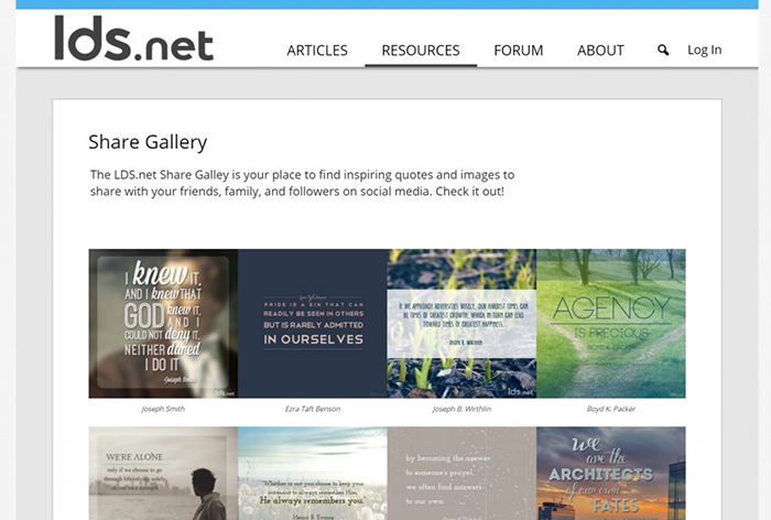
For now we’ve got a “What to Share” section that gives you great resources that you can share on social media. “How to Share” includes world-class curriculum on using social media sites.
In the articles section, we made the content our readers used most often the easiest to find. If you select a category, you’ll see our beautiful new category pages to help you find only the content you’re interested in.
Connecting You with Content

Connecting our readers with content that they will enjoy was one of the most important goals of our redesign. So in addition to our infinite article scroll (now horizontal) we’ve pulled out three ways for you to discover new content.
Even veteran readers of the LDS.net forums will appreciate our new “Best of the Forum” feature which will highlight the ongoing forum conversations that are the most interesting today. And if you haven’t read the forums yet, this is the perfect way to jump in.
Our new featured authors section helps highlight the many fantastic authors and brands that contribute to LDS.net. Come here to discover your new favorite author, or if you already have an author you love, this section will help you quickly see if they’ve put up a recent new post.
We also invite you to take advantage of our new perks. Our perks section will include free music, lectures, and e-books for the loyal subscribers of our weekly “Best of LDS.net” newsletter. Anyone can sign up for our perks program at any time.
Sharables
The new LDS.net makes it easier than ever before to share your favorite content. This starts with our sharables section. Find our shareables section at the bottom of our home page or through the “What to share” link under the resources menu.
Our sharables include all of our best quote images. Find the perfect message for your Facebook, Twitter, or Instagram followers. Every time a new image is designed it will be immediately available for you to enjoy.
Our articles are easier to share than ever, too. At the bottom of every article you will now find share buttons to all of the most popular social media platforms.
How we Designed the New LDS.net
Building the new LDS.net was the collaborative work of many of LDS.net’s best.
The process began by reaching out to our readers through polls, social media, and focus groups.
We learned that our readers were looking for a site where the content they wanted was within a single swipe or click away.
Our lead designer Lindsey Langford took the process from there. “My thoughts were focused on the users throughout the design process,” she said. Her first move was to shorten up the home page.
“People aren’t interested in endless scrolling or clicking. So we zipped up the site to its essence, and then within each section, users can scroll if they are looking for more content.”
Just as Lindsey wanted the layout to feel more tightly composed, the visual feel also needed to be reigned in. “The multiple colors were overwhelming. As a designer, I’m all about simplicity.”
But Lindsey balks at taking credit. “There were many collaborative meetings,” she insists.
Paul Frame, our lead developer, took Lindsey’s vision and coded it into fruition. The new site launched January 28, 2016.
Our Commitment to You
As we continue to grow, we promise to provide you, our readers, with the most entertaining, trustworthy, and professional site we can.
We promise to continue to make improvements such as our updated forums and mobile site, coming soon
 We promise to better serve your needs every day, by listening to your feedback. Feel free to reach out with your thoughts to us at any time.
Here’s to another great year! Thanks for being our readers.


